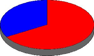
Today we looked at some pie charts. Pie charts are a great way of easily seeing how something is divided up. For example, this pie chart shows how the population of the world is divided:

This pie chart shows rich countries (red) and poor countries (blue). You can easily see that far more people live in poor countries. Compare it to how wealth is divided up:

Again rich countries are red and poor countries are blue. You can easily see that the rich countries have far more of the wealth that the poor countries, even though we know from the other pie chart that many more people live in poor countries.
Today we started looking at how to read pie charts on MyMaths Pie Chart Intro.
Once we finished that we went on to draw some pie charts of our own also with MyMaths.
For homework I would like you to do two things:
Firstly, if you haven’t done the MyMaths exercise on plotting Pie Charts in the lesson you’ll need to do it.
Secondly, I would like you to count some things and put them in a table. For example, you might watch the road for 10 minutes and look at the colour of cars going by:
| Colour |
Tally |
Total |
Degrees |
| Black |
||| |
3 |
|
| Blue |
|| |
2 |
|
| Red |
|||| |
4 |
|
| Silver |
||| |
3 |
|
| Total |
|
12 |
|
Then you can work out the number of degrees each segement should have. In this example there are 12 cars, so each car should have 360/12 degrees, or 30 degrees.
| Colour |
Tally |
Total |
Degrees |
| Black |
||| |
3 |
90 |
| Blue |
|| |
2 |
60 |
| Red |
|||| |
4 |
120 |
| Silver |
||| |
3 |
90 |
| Total |
|
12 |
360 |
Other things you could count might be the eye colour of people in your class, or their favourite colour, or their favourite lesson. Feel free to be creative, but make sure it’s something you can count easily! For example, measuring someone’s height is something quite difficult to count as everyone’s height will be slightly different, whereas something like eye colour only has a certain number of options. I wonder if anyone can think of a way of counting something like height in a meaningful way?
Once you’ve done this you can plot a pie chart of whatever it is you have counted! If you need to borrow a protractor to do this then come and find Mr Bigg or Mrs West at lunchtime.
If you have any problems then please leave a comment and I’ll do my best to help.

